There is a reason so many creators keep reaching for the look of 90s Hollywood. Films from that decade were shot on 35mm stock, finished photochemically or through early telecine, and projected with all the imperfections that digital pipelines later polished away. The result is an image that feels warm, slightly soft, and unmistakably analog. The good news is that you do not need a film camera to get there. With the right filters, effects, and editing habits, modern footage can wear the 90s convincingly.
Start With Grain and Halation
Film grain is the foundation of the entire look, and it is also where most imitations fall apart. Avoid uniform digital noise overlays, which read as static fuzz rather than organic texture. Instead, use scanned film grain plates or emulation filters that vary grain size by exposure: shadows should carry coarser, more visible grain than highlights, just as real negative stock does. Layer it at 15–30% opacity and judge it at full playback speed, not on a paused frame.
Halation is the second signature. On real film, bright light sources bled a soft reddish-orange glow into surrounding areas because light bounced off the back of the film base. Recreate it by duplicating your footage, isolating the highlights, blurring them generously, shifting the result toward warm red, and blending it back over the image. Practical lights, windows, and neon signs suddenly start behaving like they did in a 1994 frame. Halation behaves the same way in motion as in stills, so the same recipe works whether you are grading a short film or a single photograph.
Grade for the 90s Palette
The 90s color palette sits between the earthy 70s and the teal-and-orange 2000s. Blacks were lifted slightly and often leaned toward warm brown rather than pure black. Highlights rolled off gently instead of clipping. Skin tones ran golden and saturated, and primary colors — especially reds and yellows — popped harder than today's desaturated grades allow.
In practice, start by raising the black point a few percent and adding a touch of warmth to the shadows. Pull a gentle S-curve for contrast, but keep the shoulder soft so highlights bloom rather than burn. Push overall saturation above your usual comfort zone, then tame skin separately. Finish with a subtle Kodak-style print emulation LUT — stocks like 2383 are widely emulated in modern editors — applied at reduced intensity so it flavors the grade instead of dominating it. Test the grade on daylight exteriors first, since that is where the decade's warmth shows most clearly.
Lenses, Movement, and Cutting Rhythm
The look is not only color. Nineties cinematography favored spherical lenses with mild edge softness, modest flares, and noticeable breathing on focus pulls. If you shoot on clinical modern glass, add a faint vignette, a hint of chromatic aberration at the frame edges, and a soft diffusion filter to take the digital crispness off faces.
Editing rhythm matters just as much. Cuts in 90s comedies and action films were slower than the modern average, with longer holds on reactions and wider master shots doing more storytelling work. Add a 4:2:2-era softness by very slightly reducing sharpness, and consider finishing in a 1.85:1 frame, the dominant comedy aspect ratio of the decade.
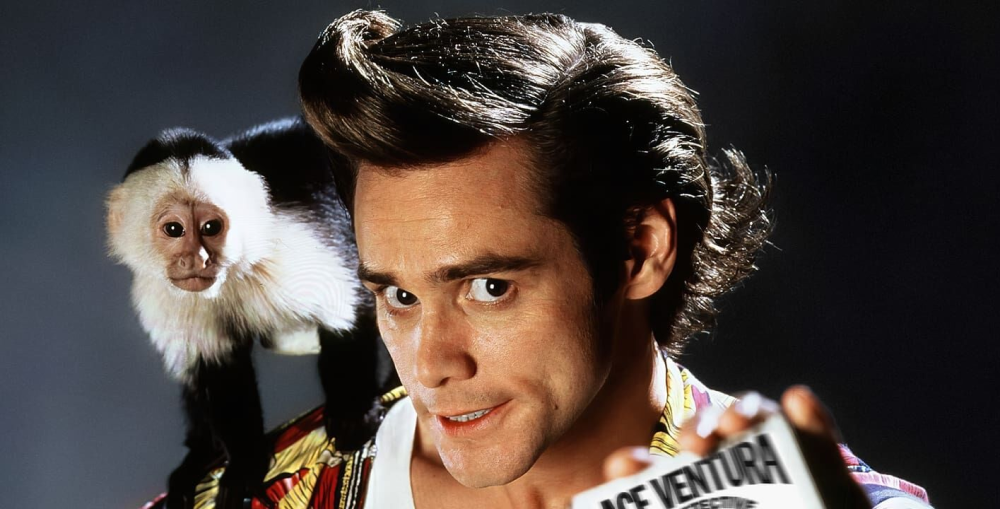
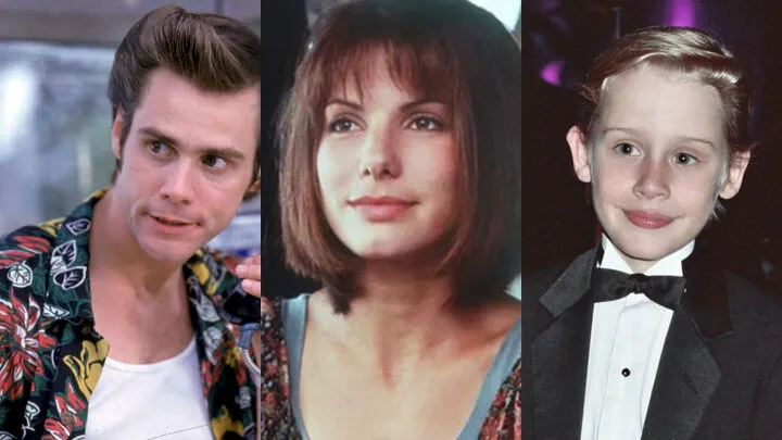
Case Study: Ace Ventura and the Anatomy of a Cult Comedy Look
Ace Ventura: Pet Detective (1994) is a perfect study object because its visual language was built entirely around one performer. Director Tom Shadyac and cinematographer Julio Macat — fresh off Home Alone — made choices that most comedies of the era avoided. They shot Jim Carrey in wide and medium-wide frames far more often than in close-ups, because his comedy lived in his whole body, not his face. Wide-angle lenses placed close to the actor exaggerated his rubbery physicality, while the camera frequently held static, letting Carrey generate all the kinetic energy inside a stable frame.
The Miami setting pushed the grade further than the typical 90s film: saturated turquoise water, hot pastel architecture, and high-key daylight exposure with almost no moody shadow work. To imitate the Ace Ventura look specifically, brighten your exposure half a stop above neutral, push cyan and magenta in the midtones, keep your camera locked off, and resist the urge to cut — the joke is in the duration. The 1995 sequel, When Nature Calls, doubled down with even broader framing and jungle greens, cementing a style that audiences instantly recognize three decades later.
Ace Ventura’s influence has also extended far beyond film. Thanks to its enduring popularity and instantly recognizable visual identity, the movie’s exaggerated physical comedy, bright tropical color palette, and eccentric energy continue to inspire modern entertainment. Elements of the “Ace Ventura vibe” can be seen in contemporary video games, mobile games, and even online casino branding, where colorful environments, playful character designs, and over-the-top humor echo the film’s distinctive aesthetic. Some platforms, such as Shikaka, have embraced a similarly vibrant and comedic atmosphere, demonstrating how a cult comedy from the 1990s still shapes visual trends and audience expectations decades later.
Why the 90s Look Keeps Coming Back
That recognizability is exactly why the aesthetic is everywhere again. Streaming-era films grade themselves to look like rediscovered prints, indie games ship with grain and halation toggles, and entertainment brands across genres borrow the loud palettes and confident framing of 90s comedies because they signal fun without saying a word. For editors, this is an invitation: the tools above are not nostalgia for its own sake, but a proven visual vocabulary that audiences already love. Learn the grain, master the palette, respect the wide shot — and your footage will speak fluent 1994.