There is a moment that happens in both Instagram and a well-designed mobile game. You have just done something — posted a photo, completed a level, collected a reward — and the screen responds with a small cascade of animated elements: a colour burst, a satisfying sound, a number that ticks upward. You did not ask for this. You did not consciously wait for it. But your attention sharpens, your thumb hesitates over the screen, and without quite deciding to, you stay.
This is not a coincidence. It is design. And the design principles behind it travelled from social apps to mobile games — and back again — in ways that most players never notice and most designers rarely discuss openly.

The Interface That Disappears
The first thing that photo-sharing apps perfected, and that mobile games later adopted wholesale, was the art of making the interface invisible.
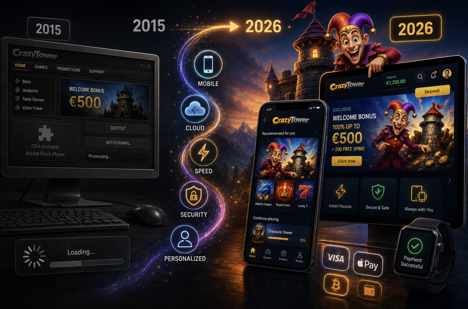
When Instagram launched its redesigned camera interface in 2016, the most significant change was not a new filter or a new feature. It was the removal of visual clutter — buttons consolidated, labels stripped away, the image itself promoted to the dominant element. The logic was simple: every pixel of interface competes with the content. The less the user sees the frame, the more they feel inside the picture.
Mobile games arrived at the same conclusion through a different route. Early casual games — the Flash-era predecessors of the App Store generation — were cluttered with HUD elements, text labels, score counters in multiple corners, and tutorial overlays that never quite went away. Players could see the machinery of the game. The experience felt like operating a device rather than inhabiting a world.
The shift toward what designers call "ambient UI" — interface elements that appear when needed and recede when not — came partly from watching how photo apps handled the same tension. The camera interface on a smartphone is, fundamentally, a real-time game: you are composing a shot, tracking a moving subject, making micro-decisions about timing and framing under time pressure. The best camera apps solved the ambient UI problem elegantly. Mobile game designers noticed.
Today, the most successful casual and hyper-casual games share a visual grammar with photo apps: generous negative space, large touch targets that don't announce themselves as buttons, progress indicators that feel like aesthetic elements rather than mechanical ones. When you play CrazyTower, the stacking mechanic is foregrounded with a visual clarity that owes more to the minimalist aesthetics of photo-editing tools than to traditional game HUD design. The score exists, but it does not compete with the act of play. The interface serves the focus rather than demanding it.
Colour as Emotional Architecture
Photo apps taught mobile games something counterintuitive about colour: restraint amplifies impact.
The Instagram filter interface — particularly the original set of high-contrast, warmth-saturated filters — demonstrated that a small, curated palette applied consistently creates stronger emotional resonance than a wide range of options. Users did not want infinite colour choices. They wanted to feel that their photo had been transformed into something with a recognisable mood. The colour did the emotional work that the composition could not always do alone.
Mobile games have applied this principle with remarkable precision. The colour language of the most successful titles is not accidental and not broad. It is a deliberate system in which specific hues carry specific emotional freight.
Warm oranges and yellows signal reward states — the colour of coins collected, of levels completed, of streaks maintained. This is not arbitrary: these colours sit at the high end of the arousal spectrum in colour psychology, and their use in reward moments amplifies the felt significance of those moments. Blue and purple tones mark transition states — loading, level-ending, achievement-unlocking — creating a rhythmic emotional counterpoint to the warmer reward palette.
The photo-app parallel is precise. VSCO, Lightroom Mobile, and Snapseed all use muted, desaturated interface colours specifically to ensure that the user's image — which can be any colour — remains dominant. The app's own colour palette is designed to recede. Mobile games have learned to do the reverse selectively: the game world recedes visually, and the reward moments advance, using exactly the kind of saturated warmth that photo apps carefully avoid in their interfaces.
What this creates is an emotional architecture. The player is not consciously aware of the colour shifts, but their nervous system is registering them. The transition from the cooler, quieter visual register of active play to the warmer, brighter register of a reward moment is felt as a shift in emotional temperature before it is processed as information. You know something good happened before you have read the score.
The Micro-Reward Loop and the Scroll
Instagram did not invent infinite scroll. But it perfected the emotional grammar of the micro-reward that makes infinite scroll work.
The core mechanism is this: the scroll is a low-effort, low-commitment action that produces an uncertain reward at unpredictable intervals. The uncertainty is essential. If every image in the feed were equally interesting, the scroll would lose its pull. It is the variability — the sudden appearance of something beautiful or funny or surprising amid the ordinary — that creates what psychologists working in the B.F. Skinner tradition call a variable-ratio reinforcement schedule. This is the same mechanism that makes slot machines compelling. But Instagram packaged it inside an experience that feels like leisure, not gambling.
Mobile games recognised this mechanism and built it into their core loop architecture.
The clearest expression of this borrowing is in the treatment of idle moments between active gameplay. In photo apps, the period between posts is filled with feed browsing — micro-rewards at variable intervals. Mobile games solved the same problem by creating what designers call "idle loops": small, low-effort interactions that produce uncertain micro-rewards during periods when the core challenge would otherwise pause. Chest-opening animations, spin wheels, daily gift collections — these are structurally identical to the feed scroll, providing variable-ratio reinforcement between the higher-effort episodes of actual play.
But the borrowing goes deeper than idle loops. It extends to the fundamental pacing of the experience.
Photo apps taught their users to expect reward at the micro-scale — at the level of individual interactions. A tap on a photo produces an immediate response (the like count increments, a heart animation plays). A comment produces a notification. A new follower produces a badge. Each of these interactions is a micro-reward: small, immediate, and just frequent enough to maintain the user's sense that engagement is being reciprocated.
Mobile games now operate with the same micro-reward density. Every tap, every block placed, every element collected produces some form of immediate feedback — a sound, a particle effect, a small animation. The game is not waiting for a significant event to reward the player. It is rewarding the act of attention itself, at the smallest possible granular level.
Haptics: The Layer Nobody Discusses
Photo apps were among the first mobile applications to use haptic feedback systematically — not just for notifications, but as a design language.
The precise, light tap of a successful focus-lock on an iPhone camera app is different from the heavier pulse of a saved photo. These are not arbitrary system defaults. They are designed responses that communicate information through touch before it is communicated visually. The haptic vocabulary of a photo app — the different textures of different interactions — teaches the user to feel the state of the app as much as see it.
Mobile games have developed this vocabulary significantly further, but the foundational insight came from productivity and media apps. The principle is the same: haptic feedback is not confirmation. It is communication. A mobile game that uses haptics only for failure states is missing most of the medium's capacity. The best implementations use haptic texture to differentiate between types of interaction — the light tap of a routine collection, the medium pulse of a level transition, the sustained rattle of a major reward — creating a physical layer of information that operates below conscious processing.
This matters for retention in ways that are difficult to measure but real. Players who have been trained to associate a specific haptic signature with a specific reward type begin to anticipate that signature before the visual feedback arrives. The body is primed for the reward before the eyes confirm it. This anticipation state — the moment between action and confirmed reward — is where engagement is most viscerally felt. Photo apps discovered it in the gap between tapping a share button and seeing the upload confirmation. Mobile game designers extended it into every significant interaction in the game loop.
Attention as a Scarce Resource: How Both Formats Solve the Same Problem
The deepest commonality between photo apps and mobile games is not aesthetic or mechanical. It is economic.
Both are competing for a resource — human attention — that is increasingly scarce and increasingly contested. The average mobile user in 2026 has hundreds of apps installed and a media environment that is generating more content per minute than any human could consume in a lifetime. Against this backdrop, both photo apps and mobile games face the same design challenge: not simply to attract attention, but to make the experience of giving attention feel intrinsically rewarding.
Photo apps solved this partly through community — the social reciprocity of likes, comments, and follows creates a web of interpersonal stakes that makes engagement feel meaningful. But they also solved it through what might be called "the competence loop": the experience of gradually improving at a skill (composition, editing, storytelling through images) in a way that generates visible evidence of that improvement over time.
Mobile games have their own version of this loop, and the parallel is more precise than it first appears. The player who gets better at a mobile game is not simply scoring higher. They are developing a form of visual and motor literacy — learning to read the visual grammar of the game, to anticipate patterns, to execute actions with increasing precision. This is the same kind of skill development that photo apps support, and it produces the same psychological effect: the sense that time spent is building something, not just passing.
CrazyTower demonstrates this principle in a particularly clean form. The stacking mechanic is simple enough to begin in seconds and complex enough that genuine improvement is possible and visible. The player who returns after several sessions is a better player — they have developed spatial intuition about the physics, timing sensitivity about the placement windows, strategic awareness about risk and stack stability. This is not casual in the pejorative sense. It is casual in the sense of accessible — and that accessibility, combined with a genuine skill ceiling, is exactly what the best photo-editing apps share. You can use VSCO on day one without knowing anything. You can also, after months of practice, use it in ways that a beginner cannot. The gap between the floor and the ceiling is what sustains long-term engagement.
The Notification as a Design Object
Push notifications are the most contested terrain in the attention economy, and mobile games did not invent them. Photo apps did — or more precisely, social apps built the behavioural infrastructure that made push notifications feel like a normal part of digital life.
The early Instagram notification — someone liked your photo — was a masterclass in minimum viable social information. It told you one thing: someone paid attention to you. It did not tell you who or why. The incompleteness was the mechanism: to resolve the incompleteness, you had to open the app. The notification was not information. It was a hook.
Mobile games took this hook and gave it a time dimension. The "your energy has refilled" or "your construction is complete" notifications are structurally identical to the social notification — incomplete information that requires app-opening to resolve — but they add urgency through implied scarcity. The energy that has refilled will deplete again if you don't use it. The construction that completed is waiting for your action to proceed. The notification creates both curiosity and mild anxiety, a combination that produces higher re-engagement rates than either alone.
What is interesting is the direction of borrowing in this domain. Mobile games have recently begun moving away from explicit scarcity-based notifications and toward the more subtle social reciprocity model that photo apps originated. Games with social features increasingly notify players when a friend has beaten their score, when a gift has been sent, when a cooperative task requires their participation. These notifications are more like the original Instagram notification than the traditional mobile game energy alert: they invoke social stakes rather than resource stakes, and social stakes prove more durable as motivators over time.
What Players Never See
The convergence between photo apps and mobile games is not visible to the player, and it is not meant to be. The design language of engagement works precisely because it operates below the threshold of conscious attention.
When a player feels the warm haptic pulse of a completed level, sees the colour temperature of the screen shift toward gold and amber, watches a cascade of animated particles respond to their action, and hears a sound design that confirms success before the visual feedback is fully processed — they are experiencing a system whose components were developed across social media, productivity software, camera interfaces, and game design over a decade of collective iteration.
The sophistication of this system is worth acknowledging even — especially — by players who consider themselves resistant to it. The attention economy does not require your consent to be effective. It requires only your attention, applied repeatedly over time, to the small rewards that both photo apps and mobile games have learned to deliver at the exact intervals most likely to bring you back.
Understanding the mechanism does not dissolve its effects. But it changes the relationship to them. And it suggests something that neither the mobile gaming industry nor the social media industry tends to advertise: that the experience you are having has been engineered, carefully and at considerable expense, by people who know more about what sustains your attention than you do.
That is worth sitting with — before you tap the screen again.