Two people can stand in the same spot, point their cameras at the same scene, and come away with completely different photographs. One image feels balanced and alive; the other feels flat and cluttered, though nothing in the scene changed. The difference is composition — the arrangement of elements within the frame — and it is the most learnable and least understood skill in photography. Gear varies, light varies, subjects vary, but composition is the choice that is always yours, in every single shot. Understanding a handful of its principles is the fastest way to make your photographs stop looking accidental and start looking intentional.
Composition is a decision, not a lucky accident
The first thing to internalise is that a strong photograph is composed, not merely captured. When you look at an image that works, you are seeing a series of deliberate choices about what to include, what to leave out, where to place the subject, and how to guide the eye. Beginners tend to point the camera at whatever interested them and press the shutter, treating the frame as a window that passively records the scene. Photographers treat the frame as a canvas they actively arrange.
This shift in mindset is more important than any single rule. Once you accept that every element within the borders of the frame is there by choice, you start asking the questions that composition answers: does this belong in the shot, or is it clutter? Where should the main subject sit? What is the eye supposed to do as it moves across the image? These questions, asked before you press the shutter rather than regretted afterward, are the entire discipline. The rules that follow are simply well-tested answers to them.
The rule of thirds and why it works
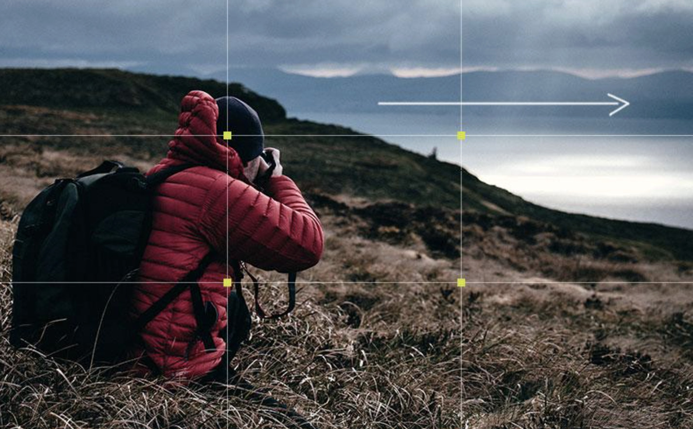
The most famous compositional guideline is the rule of thirds, and it is famous because it works. Imagine the frame divided into a grid of nine equal rectangles by two horizontal and two vertical lines. The rule suggests placing your main subject, or key elements, along those lines or at the points where they intersect, rather than dead centre. The result almost always feels more balanced and dynamic than a subject planted in the middle.
The reason it works has to do with how we look at images. A subject placed off-centre creates a sense of space and movement, giving the eye somewhere to travel and the composition a natural tension that a centred subject lacks. Placing a horizon on the lower third emphasises the sky; placing it on the upper third emphasises the foreground. Most cameras and phones can overlay this grid on screen precisely because it is such a reliable starting point. It is not an unbreakable law — centred compositions can be powerful when used deliberately — but for anyone learning, the rule of thirds is the single most effective habit to adopt.
Lines that lead the eye
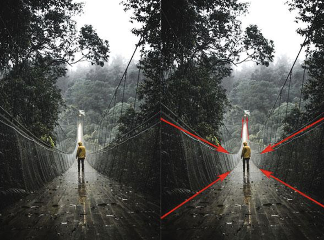
One of the most powerful compositional tools is the line, because lines direct where a viewer looks. Roads, fences, rivers, shadows, the edge of a building, a row of trees — any strong line within a scene pulls the eye along its length. A photographer who notices these lines can use them to lead the viewer straight to the subject, or to draw them into the depth of the image, creating a sense of journey and dimension.
The practical skill is learning to see the lines that are already present in a scene and to position yourself so they work for the composition rather than against it. A leading line that guides the eye toward your subject strengthens the image; one that leads the eye out of the frame or toward a distraction weakens it. Diagonal lines tend to feel more energetic than horizontal or vertical ones, adding movement. Once you start looking for lines, you will find them everywhere, and using them to shepherd the viewer's gaze is one of the most satisfying tools in the compositional kit.
The power of what you leave out
Beginners tend to fill the frame, cramming in everything of interest as if a busier image were a richer one. Often the opposite is true. Negative space — the empty or uncluttered area around a subject — is one of the most underused compositional devices, and giving a subject room to breathe frequently makes it far more striking than surrounding it with detail. Emptiness is not wasted space; it is a way of directing all attention to what matters.
This connects to the broader discipline of subtraction, which may be composition's most important lesson. Improving a photograph is very often a matter of removing things rather than adding them: stepping to one side to lose a distracting element, moving closer to cut out clutter, or simply choosing a cleaner background. The question "what can I leave out?" tends to improve a composition more reliably than "what can I include?" A simple, uncluttered frame with a clear subject and space around it reads instantly, while a busy one forces the viewer to hunt for the point. Restraint, in composition as in much of design, is a form of clarity.
Balance, symmetry, and framing
Beyond placement and lines, a photograph works when its visual weight feels balanced. Every element in a frame carries a certain heaviness — a bright object, a face, a patch of strong colour draws the eye and weighs more than empty or muted areas. A well-composed image distributes this weight so the frame feels stable rather than lopsided, whether through symmetry, where elements mirror each other for a formal, calm effect, or through asymmetry deliberately balanced so that a small strong element on one side counterweights a larger soft area on the other.
Framing is a related device worth having in your toolkit: using elements within the scene — a doorway, an archway, overhanging branches, a window — to surround and enclose your subject. A natural frame focuses attention inward, adds depth, and gives the composition a finished, intentional feel. Like the other principles, these are not formulas to apply mechanically but ways of seeing that, once learned, operate almost automatically. The photographer stops arranging by rule and starts sensing when a frame feels balanced and when it does not.
Learning to see, then learning to break the rules
The principles of composition are best understood as training wheels for the eye. In the beginning, consciously applying the rule of thirds, looking for leading lines, allowing negative space, and checking balance will noticeably improve your photographs. With practice, these become instinctive; you stop thinking about the grid and simply feel where the subject belongs. That is the point at which composition stops being a set of rules and becomes a way of seeing — the same intuitive attention that governs how the best photographers read light, a subject explored in our guide to seeing the light that separates a snapshot from a real photograph.
And once the rules are internalised, the most interesting work often comes from breaking them deliberately. A dead-centre subject, a horizon slicing the frame exactly in half, a deliberately unbalanced composition — these can be powerful precisely because they defy expectation, but only when the photographer understands what they are defying. Breaking a rule by accident produces a weak image; breaking it on purpose, for effect, produces a memorable one. The rules are there to be learned first and transcended later, which is the natural arc of developing a compositional eye.
Conclusion
Composition is the quiet engine of a strong photograph, and it is entirely within your control in every shot you take. It begins with the mindset that a frame is arranged rather than merely captured, and it is built from a handful of reliable principles: placing subjects off-centre with the rule of thirds, using lines to lead the eye, allowing negative space to give a subject room, and balancing the visual weight within the frame. Learn to see these consciously and they will soon operate on instinct, at which point you can begin bending them for deliberate effect. None of it requires better equipment — only the willingness to look at the frame as a set of choices rather than an accident. Make those choices well, and ordinary scenes start producing photographs that feel considered, clear, and alive.