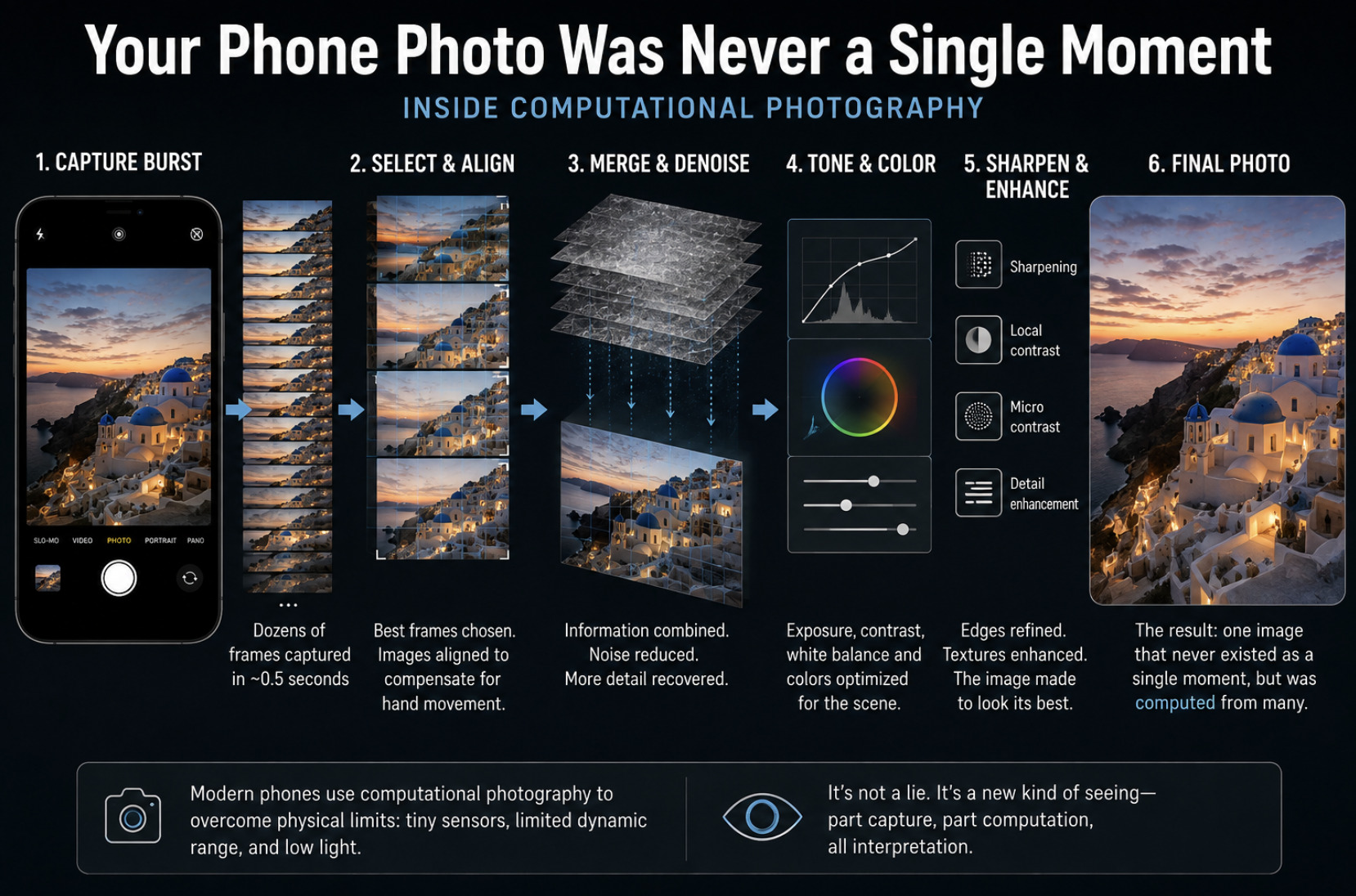
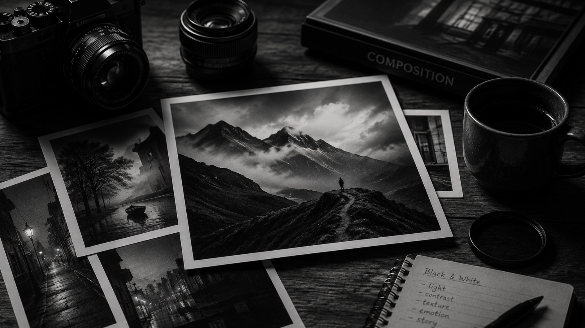
Black and white photography carries an aura that color rarely does. It feels timeless, serious, artful — which is exactly why it is so often misused. Stripping the color from a photograph is treated as a shortcut to sophistication, a filter to reach for when an image feels flat. But black and white is not a rescue for a weak picture; it is a deliberate creative choice that changes what a photograph is about. Understanding when to let go of color, and what you gain when you do, is one of the most useful skills a photographer can develop. Done with intention, black and white does not diminish an image. It clarifies it.
What black and white takes away, and gives back
The obvious thing black and white does is remove color, but the important thing is what that removal changes. Color is one of the loudest elements in any photograph. It draws the eye, sets the mood and often carries the whole emotional weight of an image. When you take it away, everything that was competing with color suddenly steps forward. Light and shadow, shape and line, texture and contrast — the structural bones of a photograph — become the entire story rather than supporting players. A black and white image asks the viewer to look at form itself.
This is why black and white can be so powerful and so unforgiving at the same time. In a color photograph, a striking hue can carry an otherwise ordinary composition. Remove it and there is nowhere to hide: if the underlying structure is not strong, the image simply looks gray and lifeless. But when the structure is strong — when the light is beautiful, the composition considered, the contrast alive — black and white lets it shine without distraction. The format rewards photographs that were built on light and form, and exposes those that were leaning on color to do their work for them.
When black and white is the right call
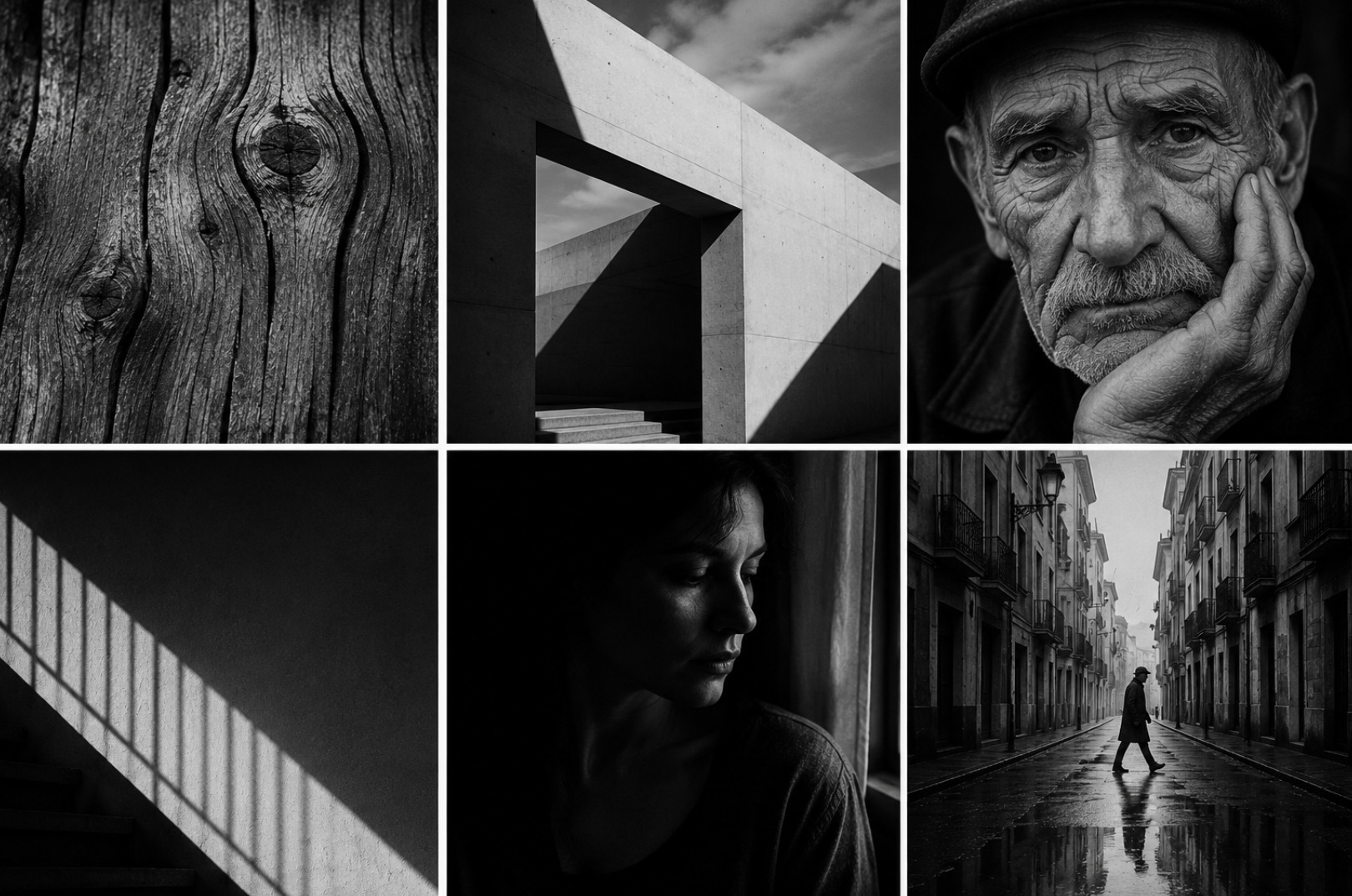
Certain images practically ask to be seen in monochrome, and learning to recognise them is the heart of the skill. The clearest case is when light and shadow are the real subject. A scene with dramatic contrast, strong directional light, or a rich range of tones from deep black to bright white often becomes more striking without color, because color would only dilute the interplay of dark and light that makes it compelling. If you find yourself drawn to a scene because of how the light falls rather than how it is colored, that is a strong signal.
Texture and form make a second natural case. The grain of weathered wood, the lines of architecture, the folds of a face, the geometry of a shadow — these read powerfully in black and white, which emphasises surface and shape. Emotion is a third. Monochrome has a way of feeling intimate and serious, stripping a portrait or a street scene down to expression and gesture. Conversely, black and white is usually the wrong call when color is the point: a photograph that lives on the warmth of a sunset or the clash of vivid tones loses its reason for existing in gray. The test is simple but demanding — ask whether the color is helping the image or distracting from something stronger underneath.
Editing with intention, not by default
Converting to black and white is not a single button; it is a set of decisions, and treating it as an afterthought is where most monochrome images go wrong. A good conversion is an active process of shaping how each color in the original scene translates into a shade of gray. Two colors that look completely different to the eye can convert to nearly identical grays, flattening an image, unless you deliberately push them apart. Learning to control that translation — brightening a sky here, darkening a background there — is what separates a considered black and white image from a lifeless desaturation.
Contrast is the other lever, and the one that gives monochrome its character. Where you place the blacks, the whites and the midtones defines the entire mood, from soft and delicate to bold and graphic. This is craft that rewards restraint as much as ambition; it is easy to crank contrast until an image looks harsh and hollow, the monochrome equivalent of overcooking a photo. The same discipline that keeps a color edit honest applies here, a balance we explore in the fine line between editing a photo and overcooking it. The aim is a full, intentional range of tones that serves the image, not a dramatic effect applied for its own sake.
Seeing in black and white before you shoot
The photographers who make the strongest monochrome images tend to decide on black and white early, ideally before they press the shutter, because it changes what they look for. When you know an image will be monochrome, you stop hunting for pleasing colors and start hunting for light, contrast, texture and shape. You notice the way a shadow cuts across a wall, the tonal separation between a subject and its background, the graphic potential of a scene that might look unremarkable in color. This shift in attention is the real skill, and it is more valuable than any editing technique.
Training yourself to see this way takes practice, but it transforms your photography even when you ultimately keep an image in color, because it deepens your awareness of light and structure. It also connects to the broader habit of seeing that underlies all strong photography, something worth cultivating deliberately, as in why the best photographers see light differently. Black and white, approached this way, is not a filter applied at the end but a way of looking that begins at the start. Let go of color for the right reasons, and you often find you were never really photographing the color at all.